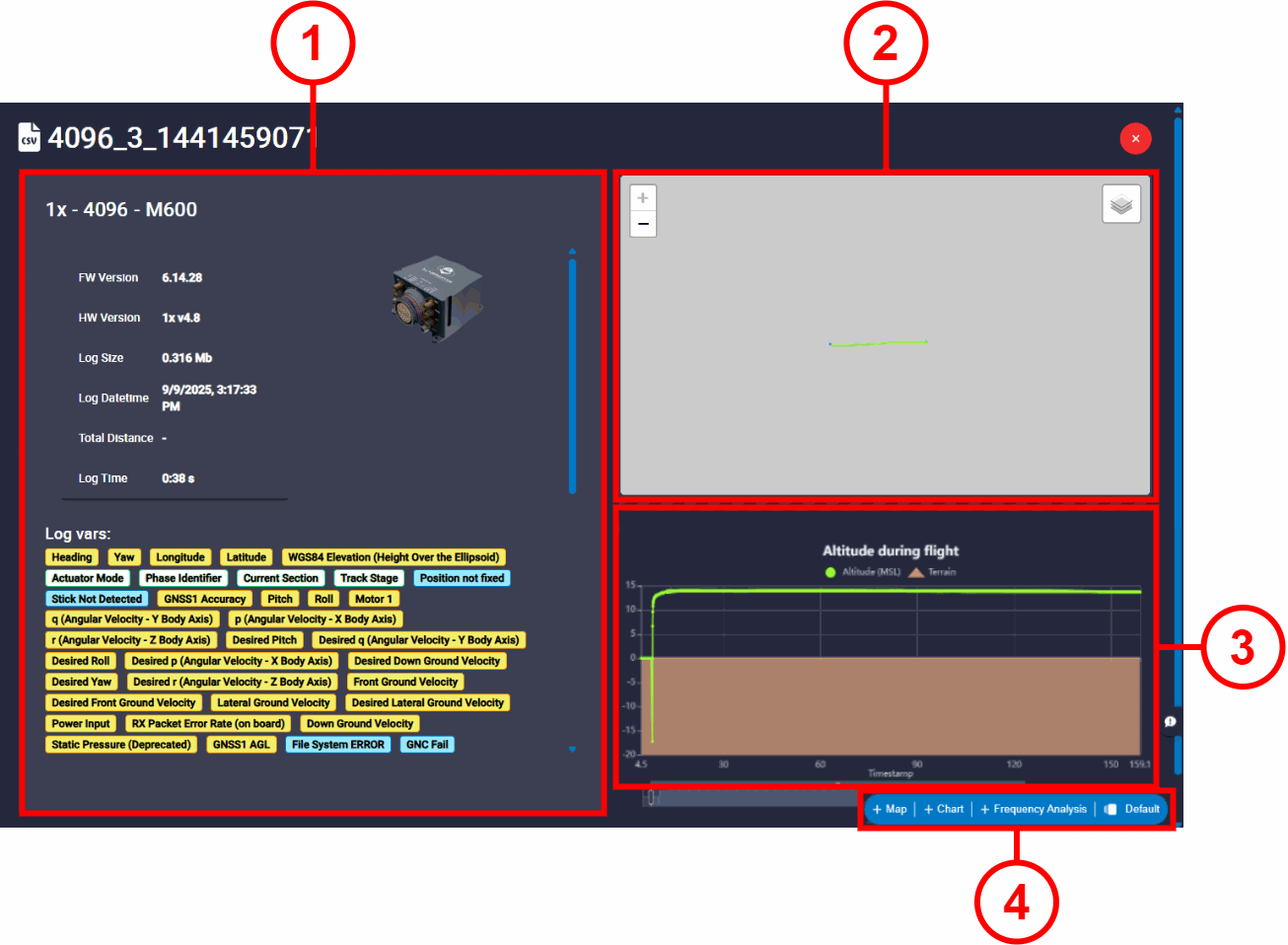
Log Analysis Panel
Once a log is selected for analysis, the system displays the main analysis interface. This interface is divided into the following sections:
Note
Remember that the log file name has the following format: [Veronte Autopilot Serial Number]_[Log type]_[Timestamp].
Where each value of Log type refers to: 2=User log, 3=Onboard log or 4=Fast log.
-
Summary:
- Veronte Autopilot information formatted as
[Veronte Autopilot unit]-[Serial Number]-[Vehicle name], Veronte Autopilot unit can be 1x or 4x. - FW / HW Version.
- Log Size.
- Log Date time: Log date and time in which the log started to be recorded.
- Total Distance: If the variable Total Flight Distance is in the selected log, its value is displayed here.
- Log Time: Total duration of the log.
-
Log vars: A complete list of all variables that have been recorded by the system during the flight is shown. To facilitate quick identification of the nature and accuracy of the data, each variable is color-coded according to its data type:
- Yellow: Corresponds to 32-bit variables, Real Variables (RVar).
- Green: Corresponds to 16-bit variables, Integer Variables (UVar).
- Blue: Corresponds to BIT Variables.
- Gray: Corresponds to 64-bit variables, Feature Variables.
- Veronte Autopilot information formatted as
-
Flight path panel: This panel displays the flight path recorded in the log on a map. The route is plotted in 2D using the
LatitudeandLongitudefrom the log. -
Altitude graph: This graph plots the
Altitude (MSL)over time (Timestamp) to provide 3D information about the recorded route.The graph is synchronized with the flight path panel; hovering the cursor over a point on the graph will highlight the corresponding location on the map, and vice versa.
-
Elements Toolbar: This toolbar allows adding different elements to analyze the variables of the recorded log.
Elements Toolbar
This toolbar allows users to create four different analysis elements:
- Map: This interface allows users to display information (latitude, longitude and altitude) from feature variables on an interactive map and graph.
- Chart: This panel allows users to create and configure custom charts to visualize log variables.
-
Frequency Analysis: This interface displays the frequency analysis of a selected variable. This is useful for identifying vibrations, noise, or other cyclical patterns in the data.
-
Workspace: Veronte FDR supports saving analysis layouts as workspaces.
Map
Click on + Map to add a map element, then its configuration menu appears:
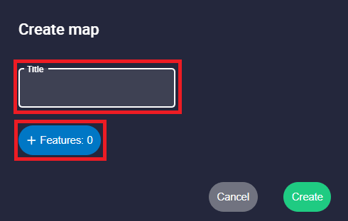
It has the following configuration parameters:
- Title: Users can add a custom name to this map element.
-
 button: Feature variables shown in the map. Users can add as many variables they wish to represent in the same map.
The appearance of these variables in the map can be configured below:
button: Feature variables shown in the map. Users can add as many variables they wish to represent in the same map.
The appearance of these variables in the map can be configured below:
Map settings - Feature variables - Select var: Users can select the desired feature variable from the recorded log to be displayed.
-
Color: This is the color in which the line with the information of the variable is drawn. By default, the first variable is drawn in blue, the second in green, the third in yellow, the fourth in red, etc.
-
 : Clicking here the user can delete this variable.
After selecting all the desired variables, click the Create button to generate the map element. It will be displayed in the lower section of the log analysis interface.
Once the map element has been created, users can access its configuration menu again by clicking on ![]() or close this element by clicking on
or close this element by clicking on ![]() .
.
The map element consists of two parts: a map on the left and a graph on the right:
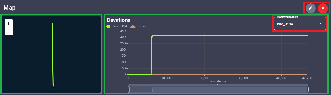
- Map: This map plots the 2D information (latitude and longitude) for all the selected feature variables.
- Graph: This graph displays the altitude information over time for a single feature variable at a time. This variable is the one selected in the Displayed feature option.
Chart
Click on + Chart to add a chart element, then its configuration menu appears:
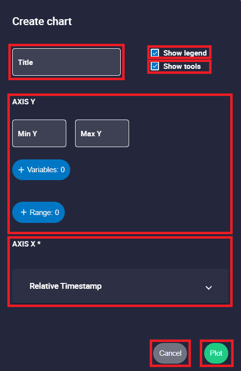
Users must set the following parameters:
- Title: Users can entered a custom name to this chart element.
- Show legend: Show/Hide the chart legend that identifies each plotted variable.
- Show tools: This option enables or disables the chart's interaction tools.
-
AXIS Y:

Chart settings - AXIS Y - Min / Max Y: Minimum and maximum Y axis of the chart can be adjusted manually. If no value is specified, the Y axis of the chart will be adjusted automatically.
-
 button: Add the variables that will be displayed on the chart.
- Select var: Users can choose any real, integer or bit variable from the recorded log to be displayed on the chart.
-
Unit Y: Unit of measurement of the displayed variable.
Note
This parameter is only available with Real variables.
-
Decimals: Number of decimals displayed for the selected variable.
Note
This parameter is only available with Real variables.
-
Color: This is the color in which the line with the values of the series is drawn. By default, the first series is drawn in blue, the second in green, the third in yello, the fourth in red, etc.
-
: Click to delete this variable.
-
 button: Enables the user to add different ranges to the chart, which are useful for highlighting operational limits or zones of interest.
- Name: An identifying name for the range can be set.
- Start / End: Defines the start and end values of the range.
- Color: Sets the color for this range.
- : Click to delete this range.
-
AXIS X:

Chart settings - AXIS X - 'Name of the selected variable': By default, Relative Timestamp is selected to display data as a function of elapsed time.
- : Deselect the current selected variable.
- Select var: Users can choose any real, integer or bit variable from the recorded log to be represented on the X-axis.
-
Decimals: Number of decimals displayed for the selected variable.
Note
This parameter is only available with Real variables.
- 'Name of the selected variable': By default, Relative Timestamp is selected to display data as a function of elapsed time.
When the chart is configured, click the ![]() button to generate the chart element. It will be displayed in the lower section of the log analysis interface.
button to generate the chart element. It will be displayed in the lower section of the log analysis interface.
Once the chart element has been created, users can access its configuration menu again by clicking on ![]() or close this element by clicking on
or close this element by clicking on ![]() .
.
This panel is composed of two main areas, a chart display area on the left and the quick settings panel on the right:
-
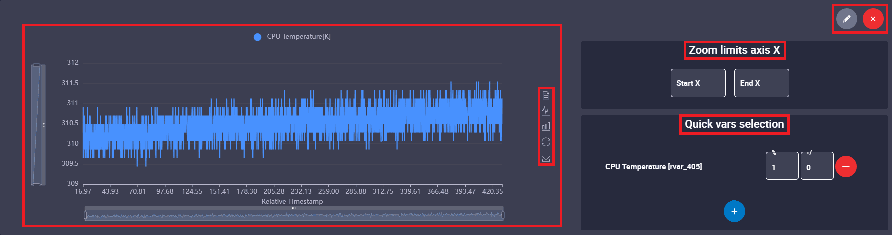
Chart display: This area shows the graphical representation of the selected variables. In this example,
CPU Temperature[K]is represented as a function of time (Relative Timestamp).In addition, users can interact directly with the chart using tools provided in the toolbar located to the right of the chart:
 Data View: Lists in a table the exact numerical values of the data represented graphically.
 /
/ Swicth to Line/Bar Chart: Switch between line and bar representations.
 Restore: Reset the view of the chart to the default zoom and scale.
  Save as Image: It is possible to save the graph as a static image, for example to generate reports.
Note
Furthermore, the user can inspect specific data points in two ways:
- Hovering the cursor over the chart displays a tooltip with the exact X and Y values of that point.
- Clicking directly on a plotted data point leaves a cursor (tooltip) open, showing its exact X and Y values. This behavior applies only when clicking directly on a represented data point, not on the line segment between two points. Note that, if users refresh the application, these cursors will disappear.

Chart element - Cursor -
Quick settings panel: This is a panel for making quick adjustments to the chart:
- Zoom limits axis X: This option allows the user to define a more specific, narrow interval for the X-axis.
- Quick vars selection:
- Multiply variable (%): This parameters is applied to the values of the selected variable as a scale factor. Default value: 1.
- Offset variable (+/-): This parameter adds an offset to the values of the selected variable. By default, 0.
Frequency Analysis
Click on + Frequency Analysis to add a frequency chart element, then its configuration menu appears:
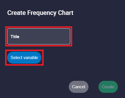
- Title: Users can entered a custom name to this frequency chart element.
- Select variable: Users can choose any real, integer or bit variable from the recorded log to be analyzed.
Once the desired variable is selected, click the Create button to generate the frequency analysis element. It will be displayed in the lower section of the log analysis interface.
Once the frequency analysis element has been created, users can access its configuration menu again by clicking on ![]() or close this element by clicking on
or close this element by clicking on ![]() .
.
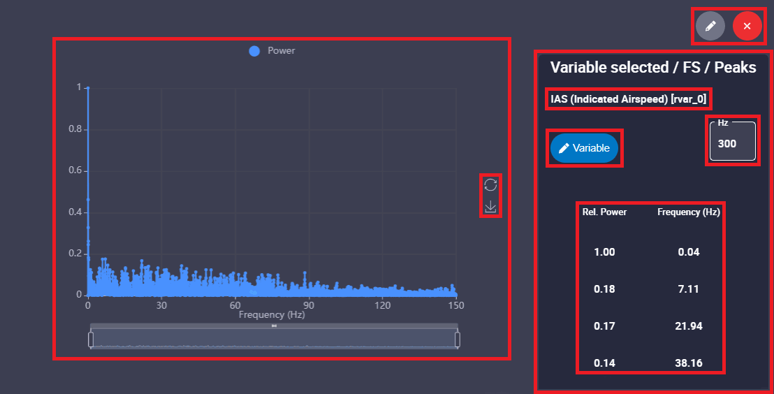
This element consists of two parts: a graph on the left and a settings panel on the right:
-
Frequency chart: This area shows the frequency analysis representation of the selected variable. The Relative Power is represented as a function of Frequency.
In addition, users can interact directly with the frequency chart using tools provided in the toolbar located to the right of the chart:
- Restore: Reset the view of the frequency chart to the default zoom and scale.
- Save as Image: It is possible to save the graph as a static image, for example to generate reports.
Note
As in the previous Chart element, the user can inspect specific data points by hovering over the data points to display a tooltip with the exact Frequency and Power values, or by clicking on them to keep the cursor (tooltip) open with these values.
-
Settings panel: Provides details about the analysis and allows quick modifications:
- Name of the variable being analyzed.
- Variable button: Allows users to select another variable from the log for the frequency analysis.
- Sampling frequency: Set the desired sampling frequency, default 300 Hz.
- Peaks: This table automatically lists the most prominent frequency peaks found in the data. For each peak, it shows the Rel. Power (Relative Power) and the exact Frequency (Hz) where it occurs.
Workspace
To improve efficiency, Veronte FDR supports saving analysis layouts as workspaces. This ensures that user-defined charts, maps, and visual preferences are preserved across sessions and applied automatically to any new logs loaded into the system.
In addition, it is possible to create different workspaces that are useful for changing the elements/variables displayed depending on the purpose of the analysis.
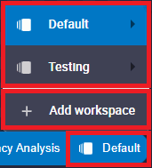
By clicking on the name of the currently active workspace, a list of all workspaces loaded in Veronte FDR will appear. In this list, the current workspace is shown in blue.
-
List of workspaces: The following options are available for each workspace:

Workspaces options - Rename: The user can rename the workspace as desired.
- Duplicate: Duplicates this workspace.
- Export: The current workspace can be exported. This file is exported in
.fdrformat. - Remove: Clicking here will delete the selected workspace.
-
Add workspace: The user can choose between adding an empty workspace or importing one from the local storage, which has been previously exported. To import a workspace, the format file must be a
.fdr.
Add workspace
© 2025 Embention. All rights reserved.